Berlin in 15 Minutes?
TEAM WORK Florian Zia, Sebastian Strobel & Lelya Kimel
AT University of Applied Sciences Potsdam
DURING Winter Term 20 / 21
TOOLS Figma, QGIS, Tableau, HTML / CSS / JS
DATA PARTNER MobileInclusion Project at TU Berlin & Hamburg
This data visualization project was developed as part of the Mapping Cities – Making Cities course by Marian Dörk. The result of the team effort is an interactive website, showing the reachability of socially essential locations and institutions throughout the German capital.
The issue
The inclusion into sharing urban benefits is determined by many factors — money and mobility being two essential ones. Together with the MobileInclusion Project, a joint collaboration between the Technical Universities of Berlin and Hamburg, we set out to examine the connection between social exclusion and mobility. The data is clear: Everyday life in large cities shows that low-income social classes can only participate in public life to a limited extent, and thus clearly less. Those affected travel shorter distances, get around less often or live in neighborhoods that are not easily accessible by public transport.
The concept
Our take at visualizing the issue and make it interactive is a fusion of the mobility and income centered dataset from the MobileInclusion project and the 15-Minute City approach by Carlos Moreno. The concept of the 15-Minute City is a model, stating that all basic everyday needs should be located within 15 minutes walking distance. We added that approach to work solution-oriented and focused on exploring the question if the mobility deficit could be addressed in a way that places and institutions are evenly distributed around people instead of folks having to travel there.

The exploration
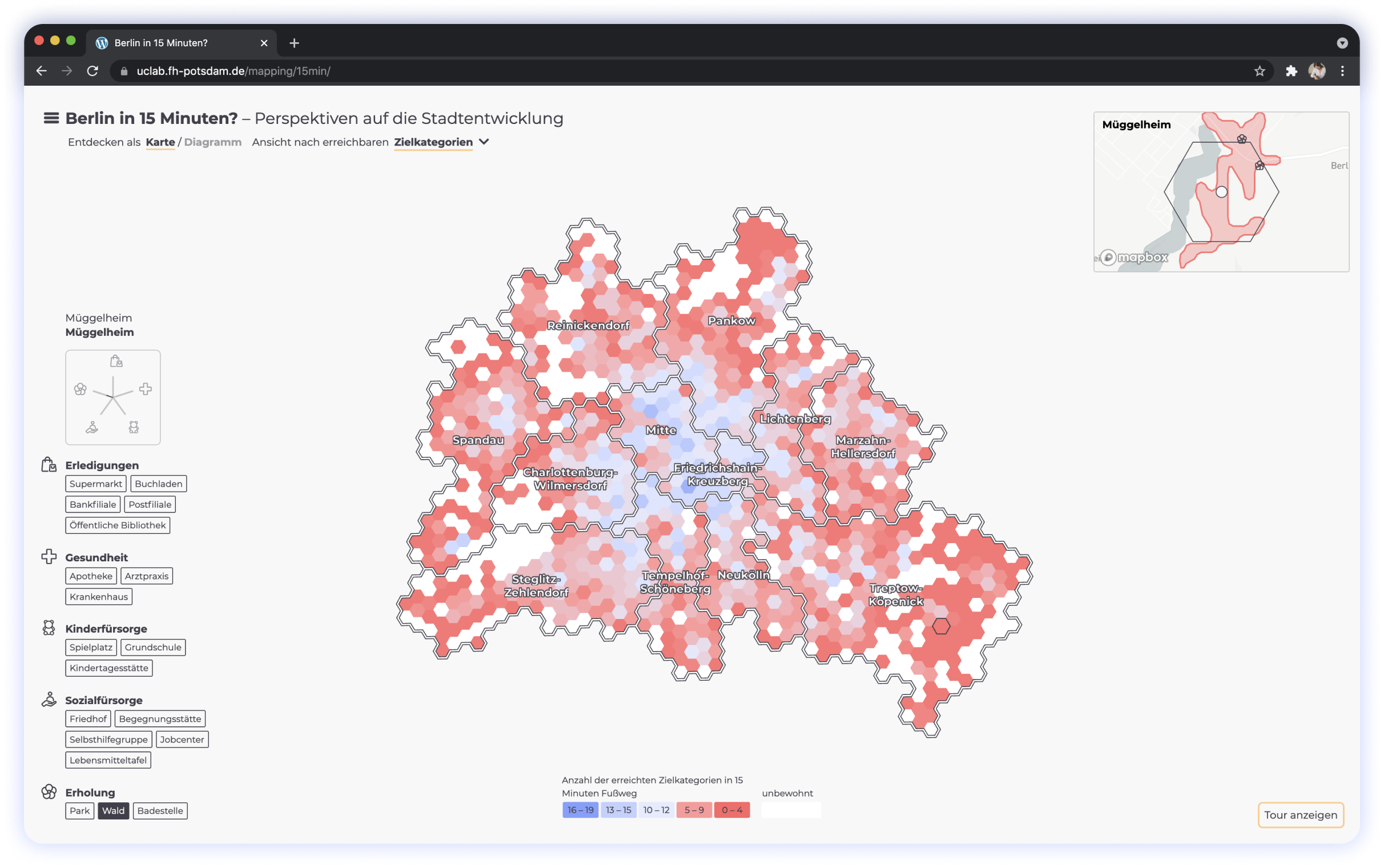
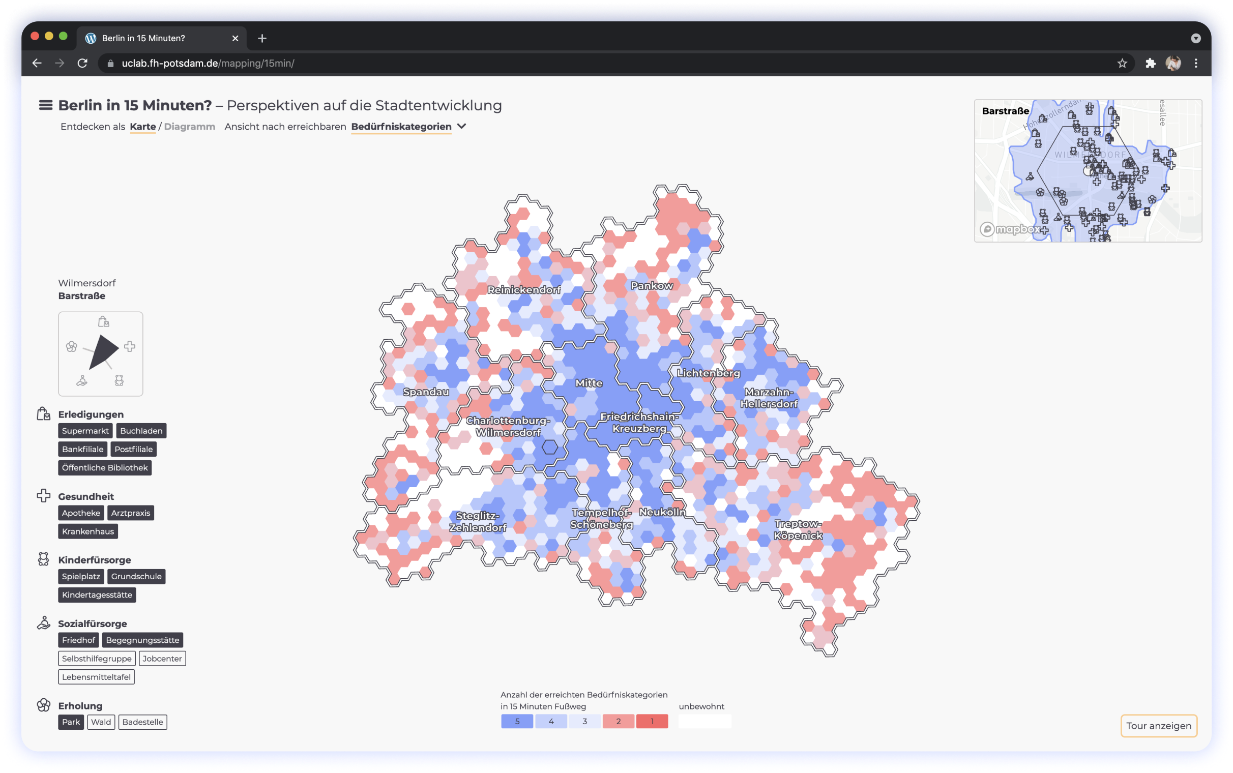
On the website you can explore Berlin from the 15-Minutes City perspective by interacting with different hexagons. Each hexagon represents a certain area in Berlin. On interaction it provides an area name as well as categories and locations of places that can be reached there. Beyond that the hexagons are compared to each other by a color legend and by the changing shapes on the spider diagram. The chart view provides an alternative data visualization of the same data set. The hexagons are arranged here according to the number of categories reached. At the same time, the hexagons remain interactive and continue to provide the information on hover and on click. If required an explanatory tour can be enabled.
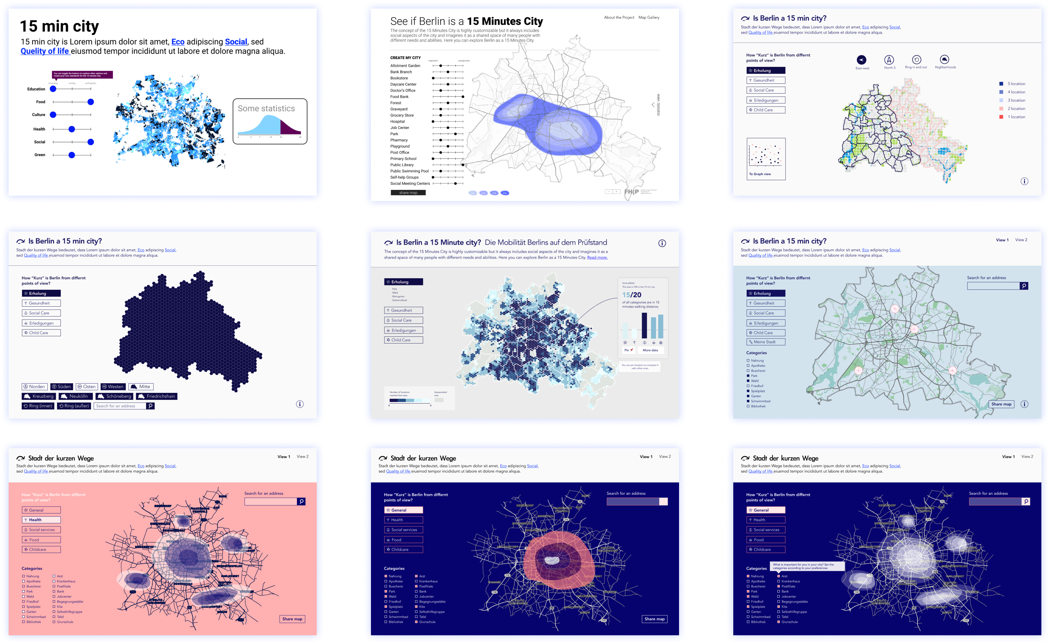
Folks, I’ve picked out 24 color schemes. Shall we go through them one by one?
My Role
In close collaboration with Lelya — I was responsible for the user experience and the user interface of the website. The geo-located data visualization in form of a Berlin-shaped map, is located at the center of the page and is instantly available. Users can begin the interaction right away and explore the functionality from there. There is no build up to the main attraction. Context information can be then accessed via the menu and the tour if so desired. For the user interface, we opted for a low-threshold, pleasant design. By avoiding glaring colors and choosing the reader-friendly, rounded Montserrat font, we communicate this complex — and to some even agitating topic — in a matter-of-fact way.
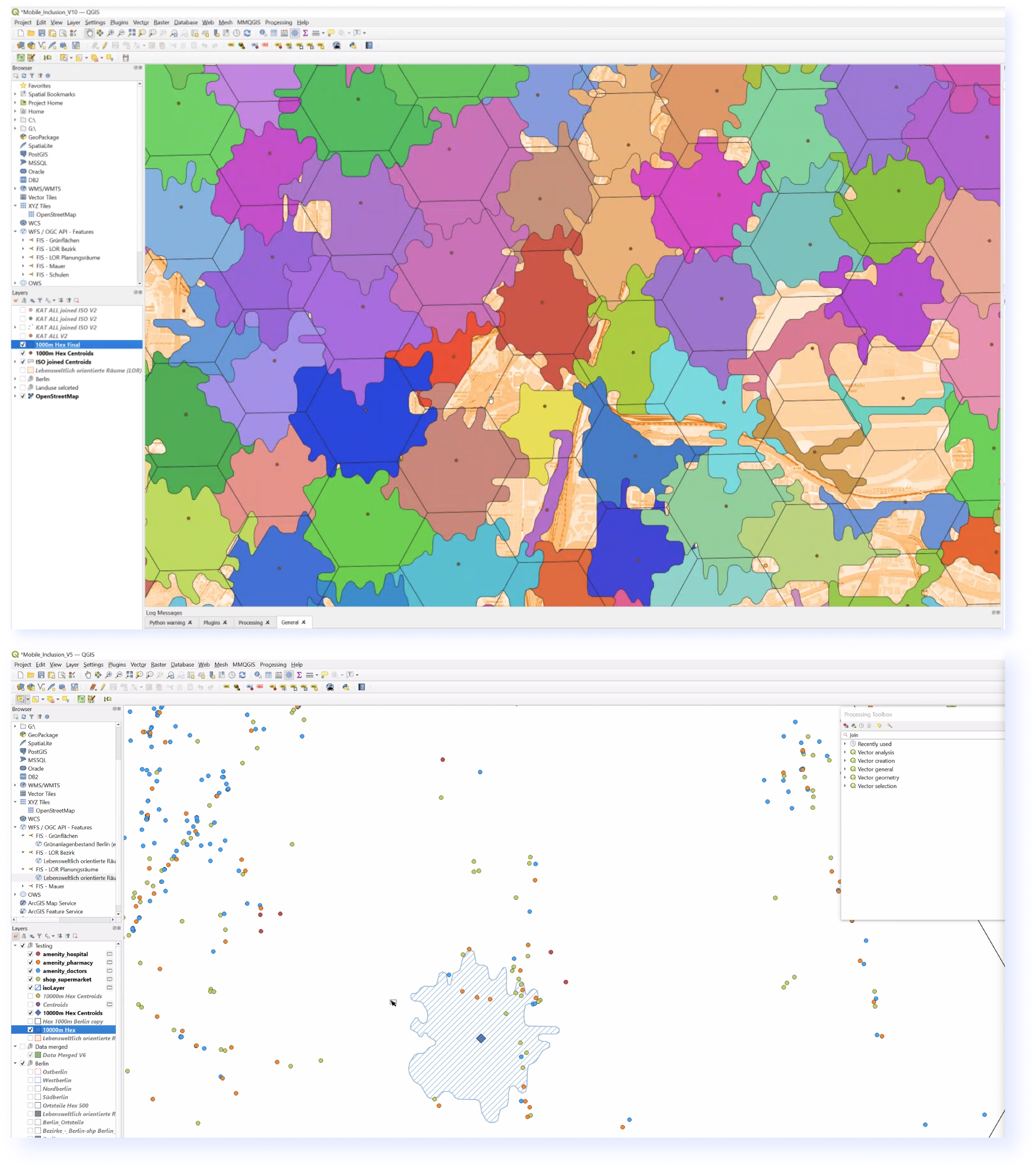
How the magic happens
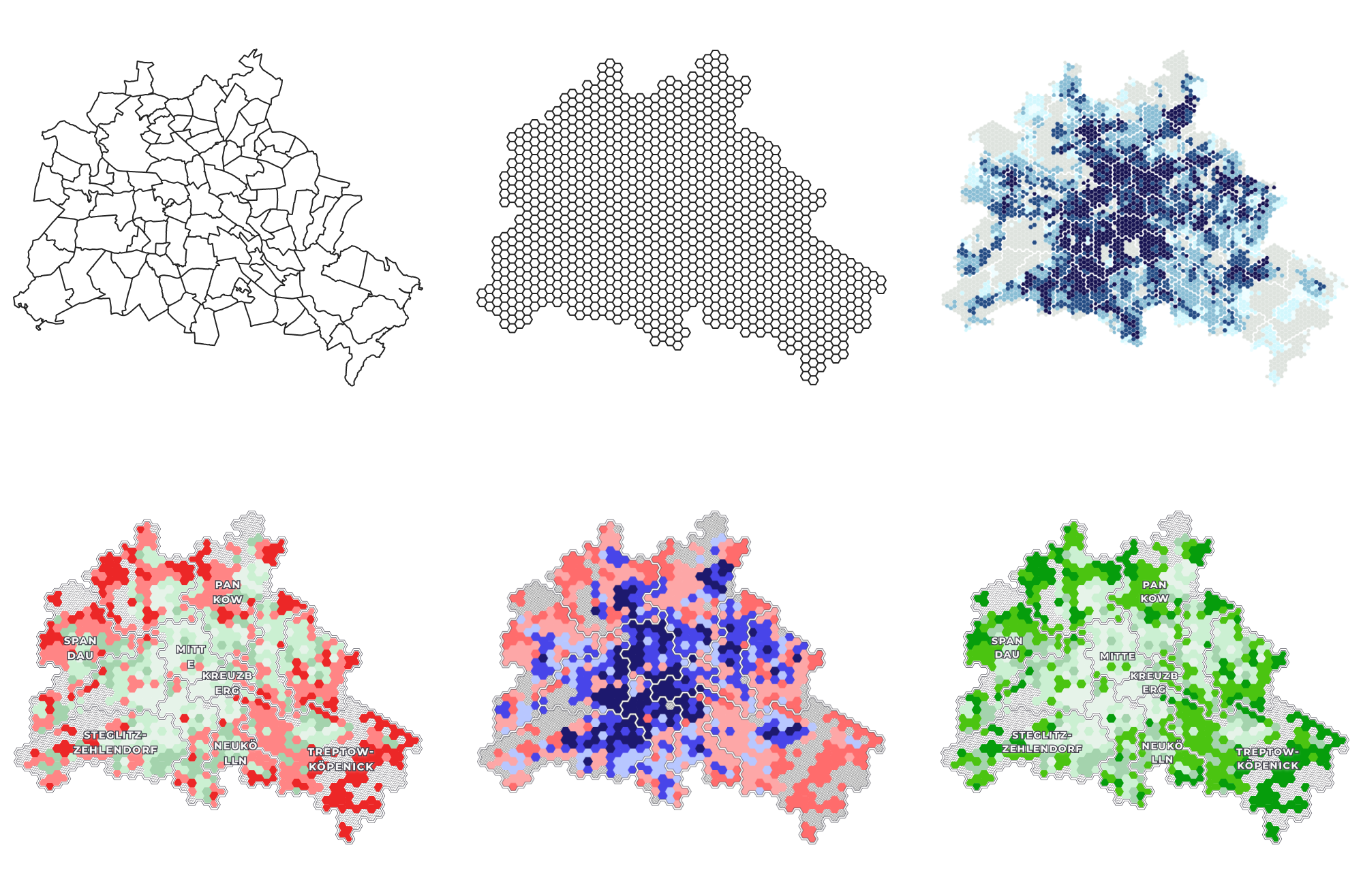
The technical part of the data implementation was done by Florian and Sebastian. Even though my primary focus is data visualization and storytelling, I keep a keen interest in the technical part. The data set is geo-location based and therefore we divided Berlin into sub-areas. Each hexagon represents a certain area with a center, a radius and an isochron line. The data for this was partially already predefined in the underlying dataset and partially collected and added by ourselves. The isochron line wraps the territory, which can be reached from the center within 15 minutes on foot. Single locations within that territory are mapped on the base map. Each location is then categorized within the 20 social categories provided by the data set.
Lessons learned
The extensive project provided an excellent opportunity to become familiar with all the steps of a data visualization project. Starting with the acqusition of data, over the collaboration with project partners to the concept development and implementation, everything was part of the project.
Working in an interdisciplinary team has shown us our individual strengths and weaknesses. A very valuable data set.